

Categories
Logo Design, Logo Identity Guideline, Stationary Design
Release Date
July 2010
Share
Overview
General Motors (GM) Brand Identity and Logo Usage Guidelines
General Motors (GM) is a globally recognized multinational corporation known for its socially responsible operations across the world. At GM, we are committed to delivering superior value through the quality of our products and services, ensuring that our customers, employees, business partners, and stockholders share in our continued success.
This style guide outlines the consistent usage of the General Motors (GM) logo, ensuring a strong, unified brand identity that resonates with audiences worldwide. The consistent application of the GM logo helps reinforce our corporate personality and Unique Selling Proposition (USP), making our brand instantly recognizable and memorable.
Key Elements of the GM Brand Identity:
Corporate Logo: The General Motors logo serves as the cornerstone of our brand identity. The logo reflects our corporate culture and values, symbolizing strength, innovation, and dedication to excellence.
Color Palette: The red color in the logo represents power and energy, aligning with GM’s passion for innovation and high-performance vehicles. It also symbolizes confidence and determination, reinforcing GM’s leadership in the automotive industry.
Logo Mark: The logo mark integrates four main brands: Buick, Cadillac, Chevrolet, and GMC. These brands are visually connected to demonstrate their collective effort in producing safe, reliable, and high-quality vehicles. Together, they reflect GM’s commitment to delivering the best possible driving experience to our customers.
Typography: The DIN Pro typeface is the official font used in GM’s corporate communications. Positioned below the logotype, the words “General Motors” are designed to convey the dynamic, forward-thinking nature of the brand, emphasizing our ongoing focus on innovation and customer satisfaction.
Brand Values:
- Innovation: GM continuously pushes the boundaries of automotive technology and design.
- Safety: GM is dedicated to delivering the safest vehicles on the road, backed by extensive research and development.
- Quality: We are committed to the highest standards in all aspects of manufacturing, ensuring reliable and long-lasting products.
- Sustainability: As part of our global responsibility, GM operates with a focus on environmental sustainability and social impact.
Usage Guidelines:
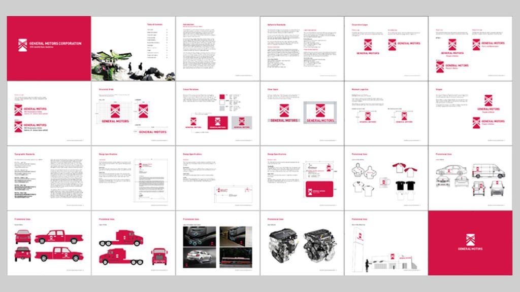
To ensure that GM’s corporate identity is consistently applied across all platforms, the logo should be used according to the specifications in this guide. This includes the appropriate color variations, spacing, and clear space around the logo. Incorrect usage can lead to a diluted brand image and confuse our audience.
