

Categories
Branding
Release Date
October 2012
Share
Overview
Daqing Oilfield General Hospital – Thoracic and Cardiovascular Surgery Department Branding & Logo Design
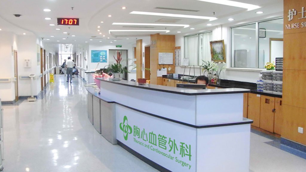
In 2012, the Daqing Oilfield General Hospital Department of Thoracic and Cardiovascular Surgery commissioned a branding and logo design project to enhance its identity and support its publicity efforts. Recognized as one of the top surgery departments in the province, the department is renowned for its advanced surgical techniques and cutting-edge medical equipment, which help treat over 1,000 patients annually.
To align with the department’s high standards of care and its vision for future expansion, the branding and logo design became a vital part of its public image strategy.
Design Concept:
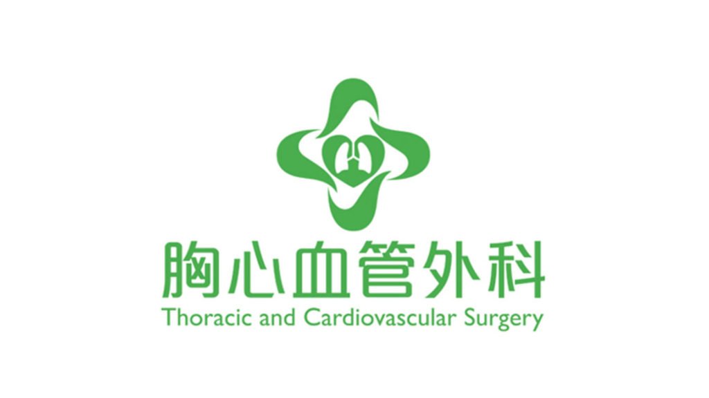
Color Palette: In contrast to the traditional red or blue often used in medical branding, the design features green as the primary color. This choice evokes a peaceful and calming atmosphere, reflecting the department’s commitment to compassionate care and healing.
Logo Symbolism: The logo features four ribbons interwoven to form a cross sign, symbolizing the four advanced surgery techniques that the department specializes in. This visual element conveys both expertise and the interconnectedness of the department’s specialized services.
Heart and Chest Icon: At the center of the design is a heart symbol, with the image of a chest inside, representing the thoracic and cardiovascular surgery focus of the department. This iconic imagery reinforces the department’s specialization in life-saving heart and lung surgeries.
The logo design effectively blends modernity, expertise, and compassion, aligning with the hospital’s high standards of care while appealing to patients seeking trust and comfort in their medical journey.
