

Categories
Branding, Logo Design
Release Date
April 2013
Share
Overview
Daqing Culture, Sport, and Travel Group – Logo Design Concepts
In early 2013, three departments in Daqing, China—Culture, Sport, and Travel—came together to form the Daqing Culture, Sport, and Travel Group. To symbolize this new integration, Z Square Studio was tasked with designing a logo that would represent the essence and future vision of the newly united group. Three distinctive logo design concepts were submitted for consideration:
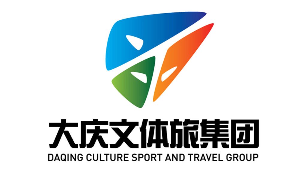
Design Concept #1: Tangram-Inspired Symbolism
The first design draws inspiration from the traditional Tangram puzzle, a popular symbol in Chinese culture known for its geometric shape and potential for transformation. In this logo, three vibrant colors represent the Culture, Sport, and Travel divisions. The white space within the Tangram cleverly forms the Chinese character “Wen” (文化), meaning culture, along with the English characters “T” and “L”, representing Travel and Leisure. This design also subtly evokes the shape of a running man, symbolizing the group’s commitment to progress and dynamic growth. The logo suggests a group that is continuously advancing toward a bright and prosperous future.
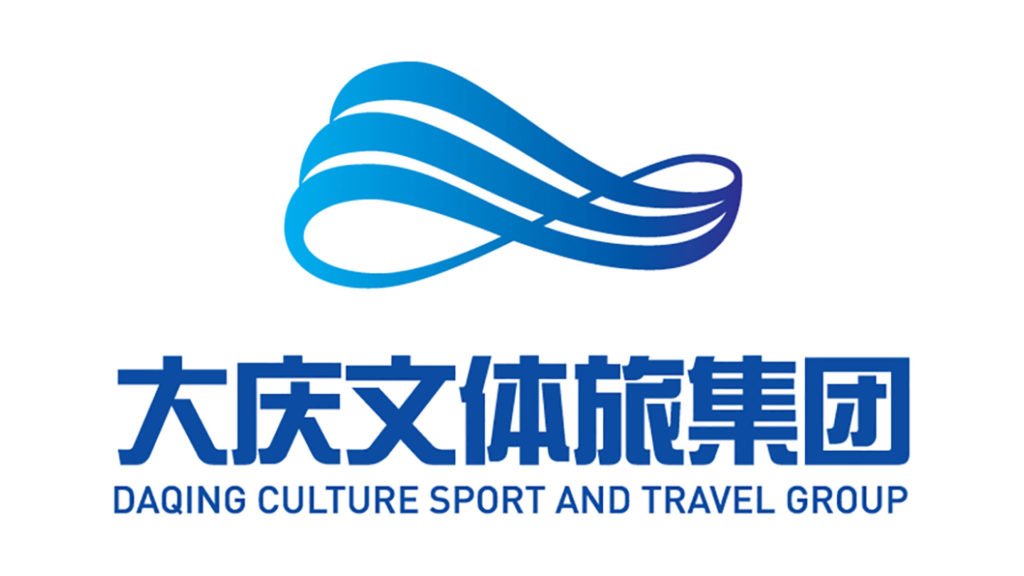
Design Concept #2: Unity and Strength through Sea Waves
The second concept features three flowing, waved strokes that merge seamlessly from left to right. This dynamic movement symbolizes the union of the three divisions into a single powerful entity. The design evokes the strength of the ocean waves, symbolizing the momentum and collective energy of the newly formed group. The cruise ship shape embedded in the logo represents the idea that the group will be the driving force to guide the city toward its future. Additionally, the logo subtly resembles the infinity symbol, conveying the idea that there are limitless possibilities ahead, and the group will continue to break boundaries and achieve the impossible.
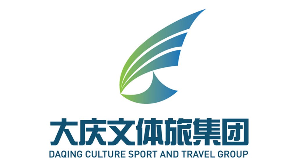
Design Concept #3: Unity and Vision through Eagle and Sailboat
In the third design, three distinct strokes converge into a single, unified form. This concept signifies the merging of the three departments into one cohesive and powerful unit. The logo’s shape also resembles an eagle’s eye, representing sharp vision, the ability to perceive opportunities, and the foresight to achieve ambitious goals. Furthermore, the sailboat shape within the logo symbolizes the group’s capacity to navigate challenges and carry the city toward its dreams, suggesting a future full of opportunity and growth.
