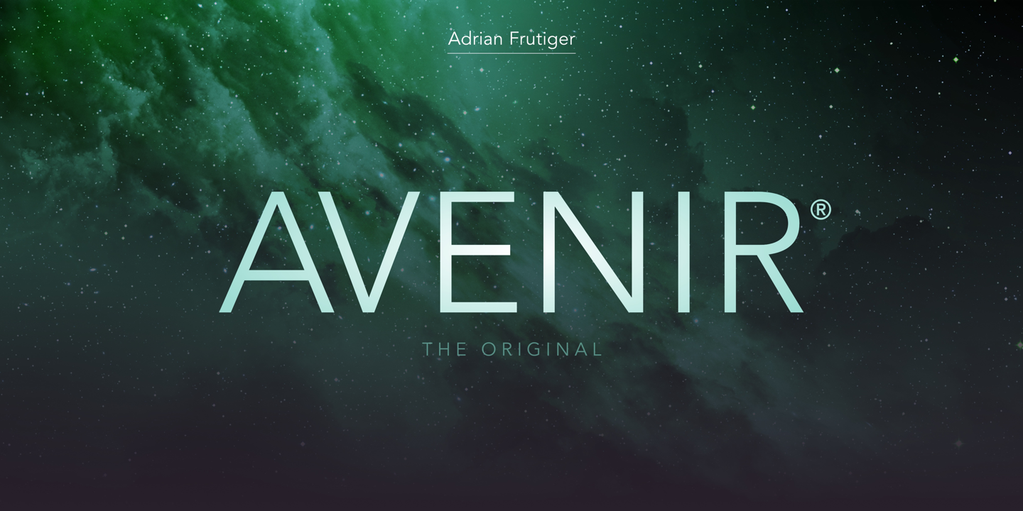
In the vast landscape of typography, where every curve and line holds a unique narrative, there are fonts that stand out for their timeless elegance and modern simplicity. One such font that has captured the hearts of designers and readers alike is Avenir. Created by renowned Swiss type designer Adrian Frutiger in 1988, Avenir has become a symbol of sophistication, readability, and versatility in the world of graphic design and beyond.
A Journey Through Time and Design:
Avenir, which means “future” in French, was aptly named to represent its forward-thinking design philosophy. Frutiger envisioned a typeface that combined the elegance of classical fonts with a modern twist, making it suitable for a wide range of applications. The result was Avenir, a sans-serif font that effortlessly marries tradition with contemporary design principles.
Elegance in Simplicity:
At first glance, Avenir’s simplicity is striking. Its clean lines, balanced proportions, and rounded forms give it a friendly and approachable demeanor. The font’s subtle geometric shapes and generous letter spacing enhance readability, making it a favorite choice for both print and digital media. Whether used in headlines, body text, or branding materials, Avenir maintains its grace and clarity, ensuring a pleasant reading experience for audiences of all ages.
Versatility Across Platforms:
One of the standout features of Avenir is its versatility. It seamlessly adapts to various contexts, from print publications and websites to mobile applications and signage. Its compatibility with different weights and styles allows designers to create visually engaging content while maintaining a cohesive look and feel. Whether it’s a sleek corporate brochure, a user-friendly website, or an impactful logo, Avenir effortlessly meets the demands of diverse design projects.
Avenir in the Digital Age:
In the digital age, where information is consumed across a multitude of devices and platforms, Avenir remains relevant and reliable. Its legibility on screens of all sizes ensures that readers can engage with content comfortably, whether on a smartphone, tablet, or desktop computer. This adaptability has made Avenir a staple choice for responsive web design, ensuring that websites look polished and professional regardless of the device being used.
Conclusion:
Avenir font’s enduring appeal lies in its ability to harmoniously blend classic elegance with modern simplicity. Its timeless design, readability, and adaptability have made it a cherished asset in the world of graphic design. As we continue to navigate the ever-evolving landscape of typography, Avenir stands as a testament to the power of thoughtful design, capturing the essence of both the past and the future in its graceful letterforms. So, whether you’re designing a captivating website, crafting a memorable logo, or creating a visually stunning print piece, consider embracing the elegance and versatility of Avenir font, and let your words speak with timeless sophistication.